
Startup
Case Study
Mobile App
Overview
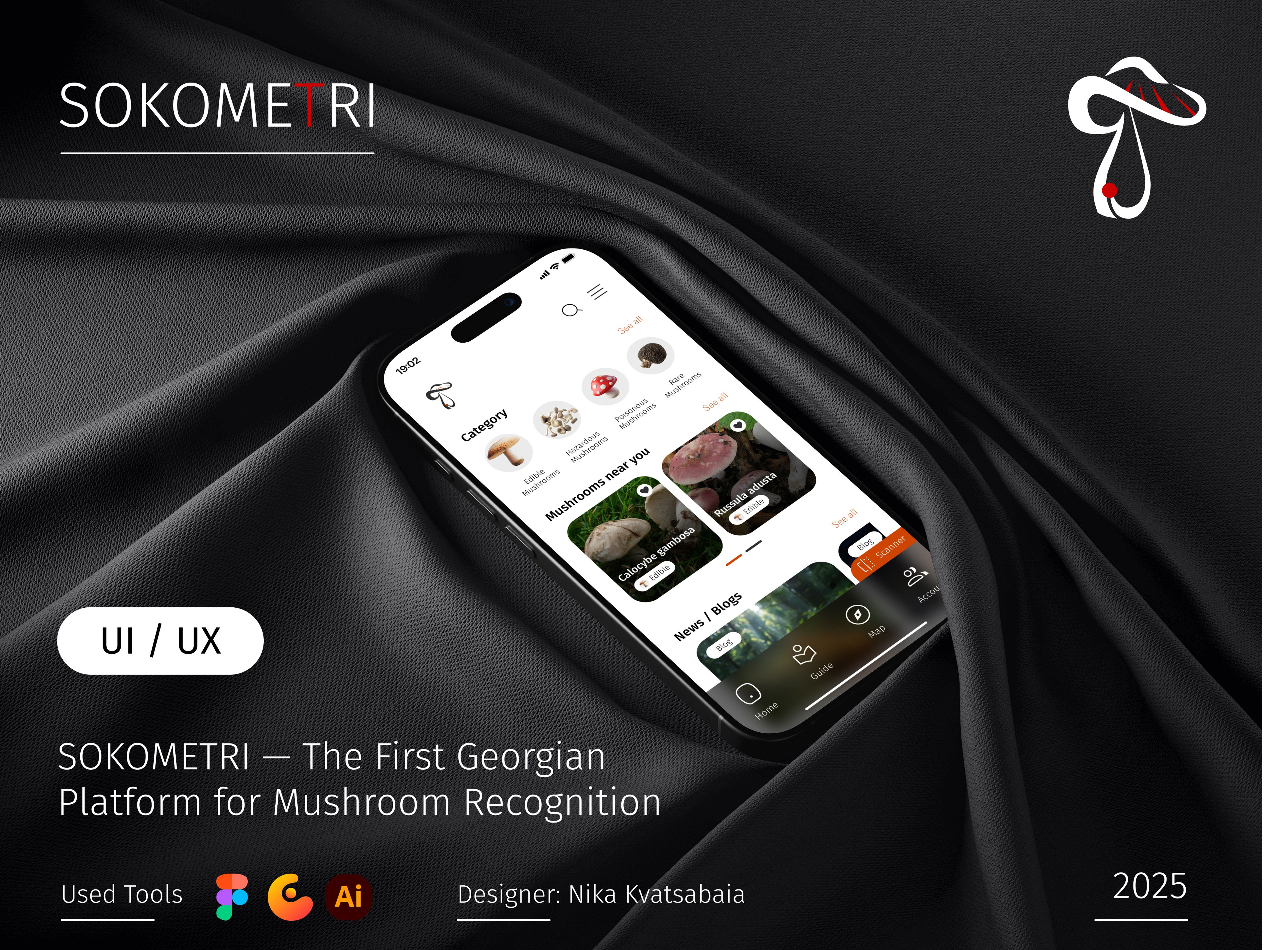
SOKOMETRI is a startup-level mobile application designed to help users identify mushrooms quickly and safely using image recognition technology. The product targets hikers, foragers, nature enthusiasts, and beginners who want reliable information without needing expert knowledge.
The goal of the project was to transform a complex and potentially risky activity into a clear, educational, and trustworthy digital experience. The redesign focuses on accuracy, confidence, and usability — ensuring users can identify mushrooms, understand risks, and learn essential details in seconds.
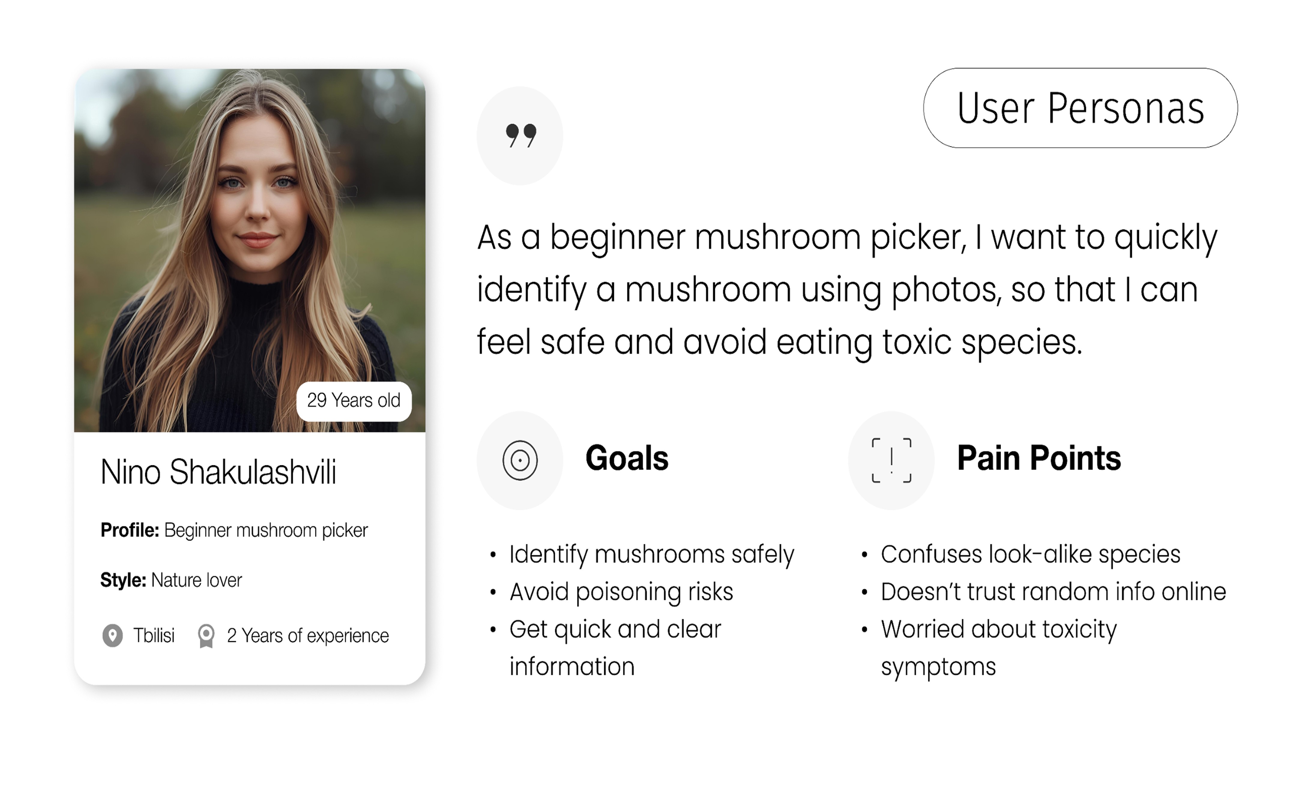
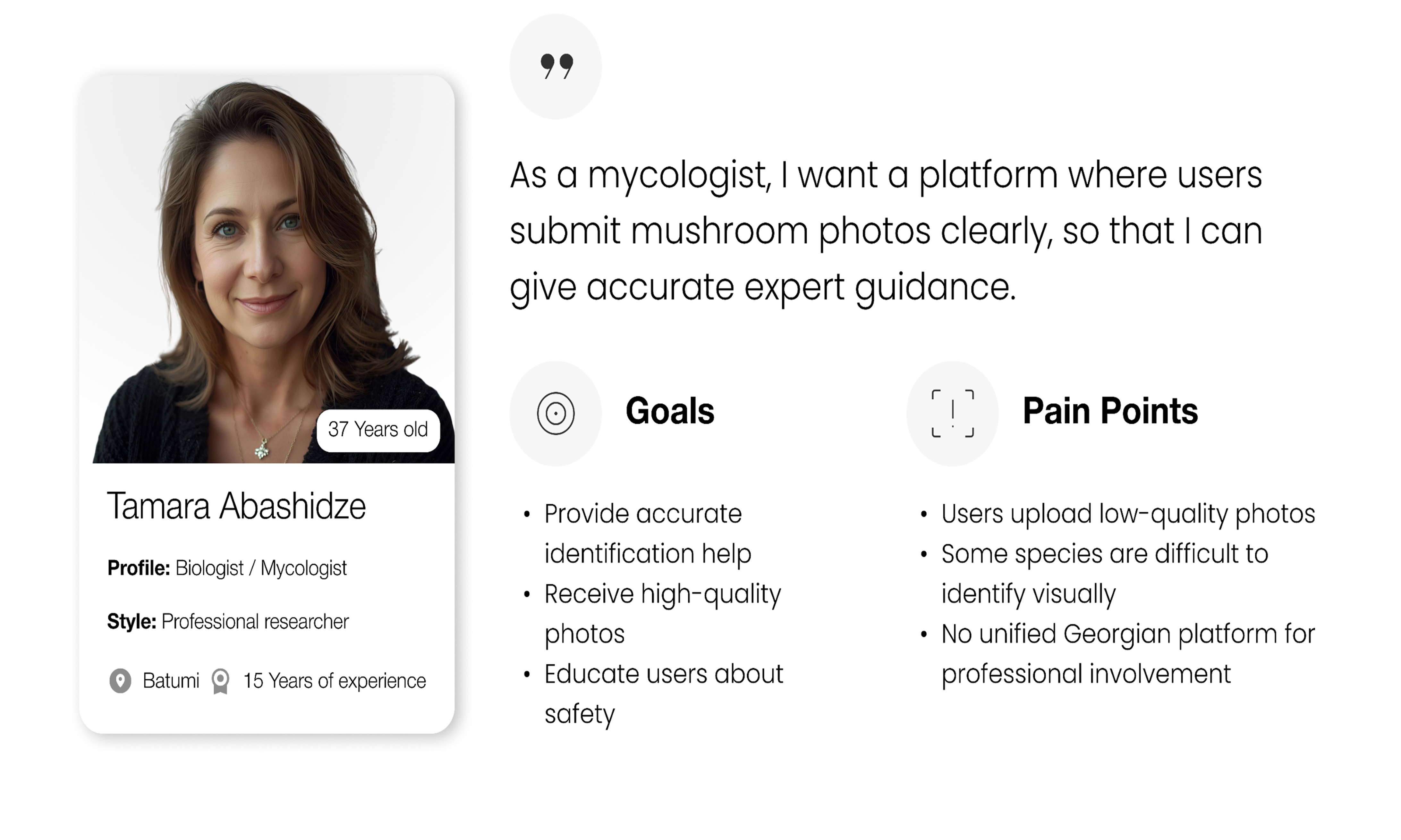
This case study is based on real product exploration and 34 collected user responses, which directly influenced UX decisions, feature prioritization, and interface clarity.
Role & Approach
As a designer, I was responsible for shaping the experience from concept to high-fidelity execution:
User Research: Analyzing 34 real user responses to understand fears, expectations, and usage contexts
Problem Definition: Identifying key pain points such as uncertainty, information overload, and lack of trust
UX Strategy: Designing simple, guided flows for scanning, recognition, and result interpretation
UI Design: Creating a bold yet calm visual system inspired by nature and scientific credibility
Prototyping: Building high-fidelity screens to validate usability and information hierarchy
The approach balanced speed and safety, ensuring that users receive clear answers without confusion or false confidence.
Research Insights (34 Responses)
User feedback revealed three dominant needs:
Immediate clarity — users want to know if a mushroom is safe, dangerous, or unknown at a glance
Trustworthy information — scientific tone without overwhelming detail
Visual confirmation — strong imagery and clear comparison details
These insights directly shaped the information layout, color usage, and interaction patterns across the app.

Key Features
Instant Mushroom Recognition
Users can scan mushrooms using their camera or upload photos to receive fast identification results supported by visual references and key characteristics.
Safety-First Results
Recognition outcomes are clearly categorized, helping users quickly understand potential risks before taking action.
Detailed Species Profiles
Each result includes structured information such as edibility, habitat, seasonality, and distinguishing features — presented in a clean, scannable format.
Educational Flow
The app encourages learning by explaining why a mushroom is identified in a certain way, increasing long-term trust and knowledge retention.
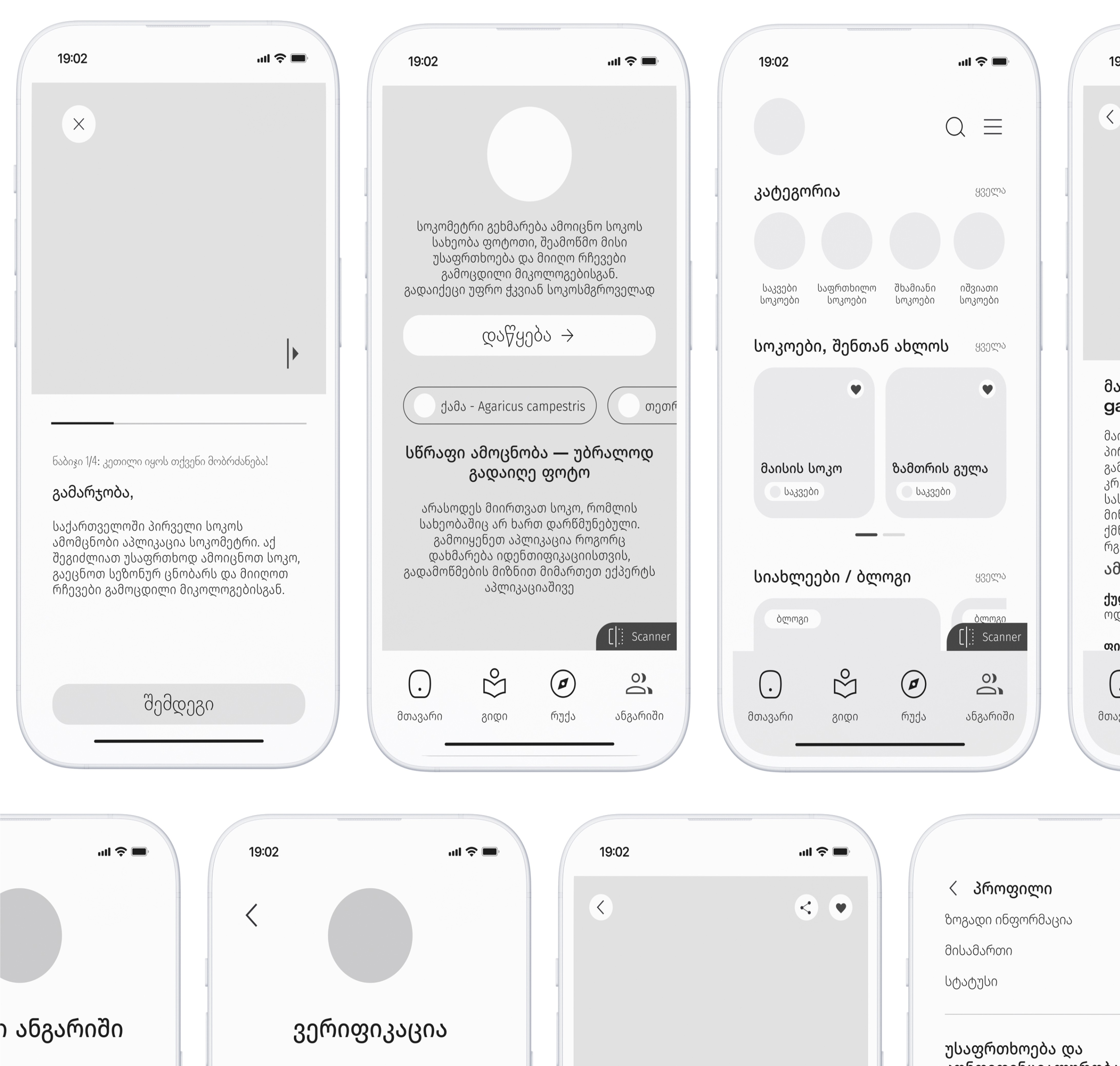
High-Fidelity Wireframes
High-fidelity wireframes were designed to simulate a real production environment and validate decision-making flows. Each screen emphasizes clarity, contrast, and content prioritization — especially in critical moments such as recognition results and safety warnings.
Layouts were optimized for one-hand usage in outdoor conditions, with large touch targets and strong visual hierarchy. The wireframes reflect real-world scenarios where users may be distracted, in motion, or under time pressure.

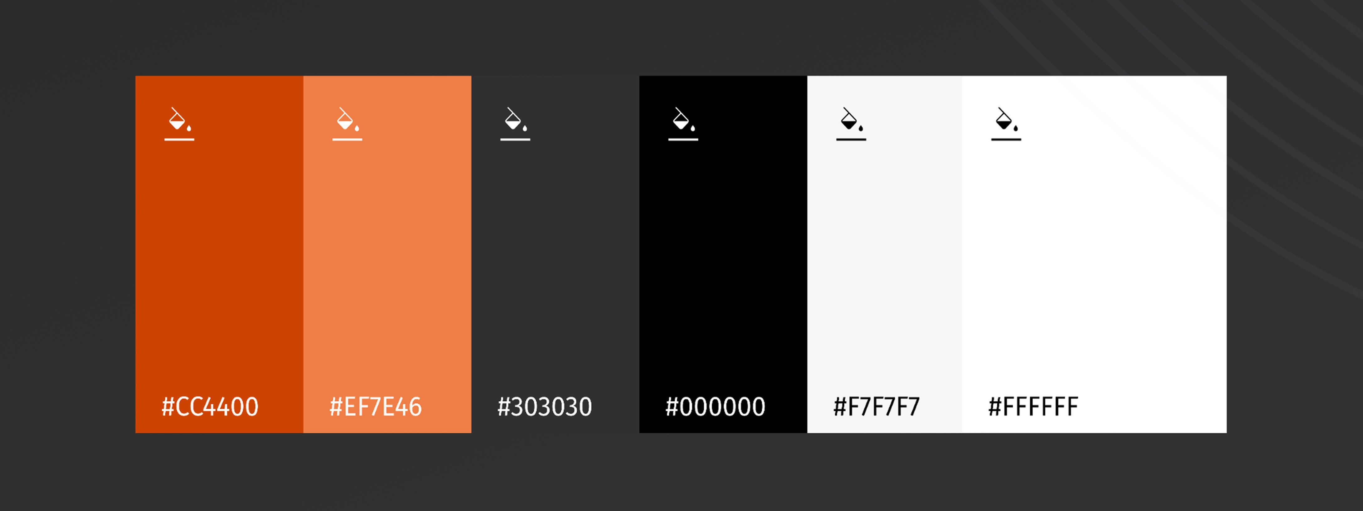
Primary Color Palette
#CC4400 — Strong, earthy accent used for warnings, highlights, and key actions
#EF7E46 — Supporting tone for interactive elements and emphasis states
#303030 — Structural color for navigation, icons, and grounded visual balance
These colors reflect nature, caution, and reliability — essential qualities for a recognition-based product.
Secondaty Color Palette
#000000 — High-contrast text and critical UI elements
#F7F7F7 — Neutral background for content clarity and reduced eye strain
#FFFFFF — Clean surfaces and card components
Secondary colors maintain calmness and readability while supporting dense informational layouts.
Typography
Fira Go was selected for its modern, technical feel and excellent legibility across screen sizes. It supports both informative and action-oriented content, making it ideal for recognition results and educational descriptions.
Font sizes used:
14 / 18 / 22 / 24 / 32
These sizes establish a clear hierarchy between metadata, descriptions, titles, and critical alerts.
BPG Nateli supports Georgian language content and ensures cultural and linguistic accessibility. It integrates seamlessly with Fira Go while preserving strong readability.
Font sizes used:
18 / 32
This pairing enables a bilingual experience without visual inconsistency.
Outcome
SOKOMETRI demonstrates how thoughtful UX and UI design can turn complex scientific information into an approachable, user-friendly product. By grounding decisions in real user feedback and prioritizing safety-driven clarity, the app establishes trust and usability — essential foundations for a growing startup product.